When decorating a room, color coordination is one of the most important aspects to consider, especially when it comes to wall art. The right piece can pull a room together, elevate the atmosphere, and even enhance your mood. But how do you choose artwork that fits your room’s color palette? Let’s break it down with simple, actionable tips to help you find the perfect match.
Why Color Matters in Wall Art
Color sets the tone of a room. Bright, bold colors can energize a space, while muted tones create a calming environment. The colors in your wall art should work harmoniously with the existing color scheme in your room to create a cohesive look. Whether you're going for a complementary, contrasting, or neutral palette, understanding how colors work together will make all the difference.
Complement the Room’s Color Palette
A great way to make your wall art feel like a natural part of the room is to pick pieces that complement the existing colors. This doesn’t mean they have to match exactly, but they should harmonize with your furniture, walls, and decor. If your room features a lot of soft, neutral tones (beige, gray, white), choosing art with subtle hues or pastels will enhance the serene atmosphere. On the other hand, if your space has rich, saturated colors, look for artwork that contains similar shades to tie everything together.
Pro tip: Stick to a color family. For example, if your room has shades of blue, find art that incorporates various tones of blue with accents of other complementary colors like green or violet.
Create Contrast for Visual Interest
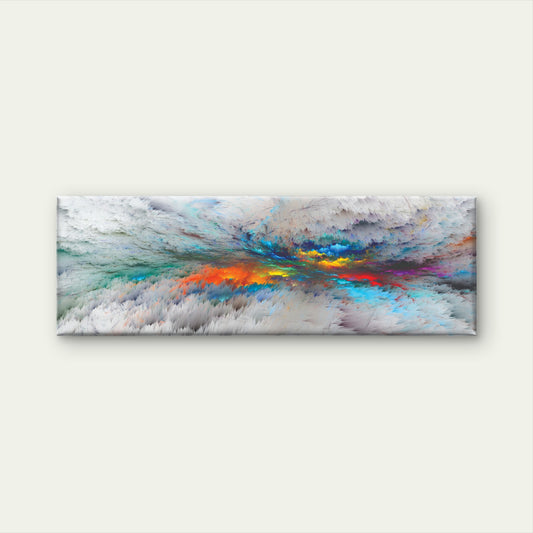
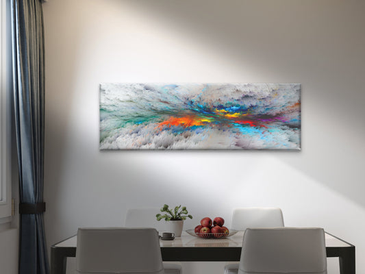
If you want your wall art to stand out and become a focal point, creating contrast is the way to go. Contrast adds depth and drama to a room, drawing the eye directly to the artwork. For example, if your walls are painted in soft, neutral shades like white or beige, a bold, colorful painting with vibrant reds, blues, or yellows can create a striking effect. Conversely, if your room already has a lot of color, opting for black-and-white or monochrome art can offer a sophisticated balance.
Pro tip: When using contrast, make sure the art doesn’t overwhelm the room. A single, bold piece often works best in neutral or minimalist spaces, while multiple small pieces can create clutter.
Use Neutral Tones to Ground the Space
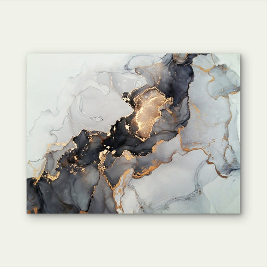
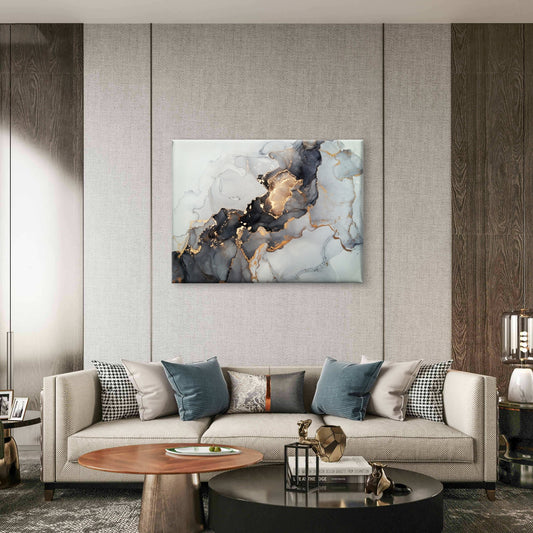
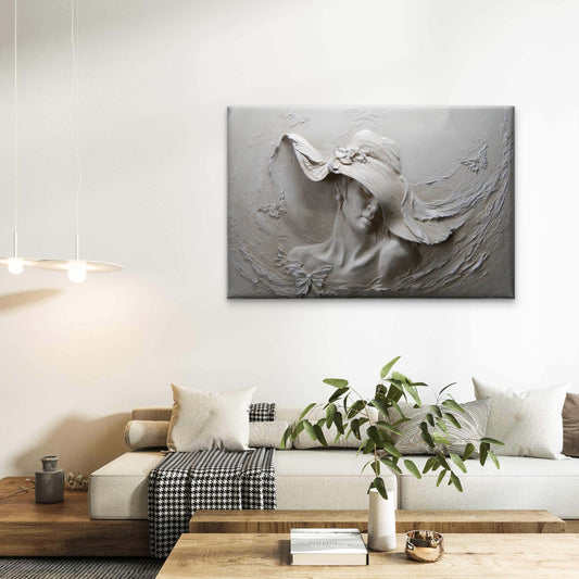
Neutral tones are versatile and work with almost any room color scheme. Wall art in black, white, gray, or earthy tones can serve as a grounding element, especially if your furniture or decor is bright or eclectic. Neutral-colored art is also a great choice if you want something timeless that won’t clash with future decor updates.

Pro tip: Neutrals don’t have to be boring. Look for art with interesting textures, patterns, or subtle metallic accents to add dimension to your space.
Incorporate Accent Colors for Cohesion
Accent colors are often used sparingly in a room, but they can be a key element in choosing your wall art. Look at the smaller details in your room, such as throw pillows, rugs, or vases. Does one color stand out as an accent? Choosing artwork that features that specific accent color can help tie the room together and create a sense of balance. For example, if you have a mostly white room with a few turquoise pillows, selecting a piece of art with hints of turquoise will bring cohesion to the space.
Pro tip: It’s okay if the accent color isn’t the main feature of the artwork. A few small splashes of the color can be enough to link the art with the rest of the room.
Consider the Mood You Want to Create
Colors in wall art don’t just affect the look of your room—they influence how you feel in the space. Cool colors like blues and greens create a calming, tranquil atmosphere, perfect for bedrooms or bathrooms. Warm colors like reds, oranges, and yellows add energy and vibrancy, making them great for social spaces like the living room or kitchen.
Pro tip: Think about how you use the room. If it’s a place where you relax and unwind, choose soothing tones in your art. If it’s a space for entertaining or working, opt for pieces with vibrant, uplifting colors.
Monochromatic Art for a Minimalist Look
Monochromatic art, which uses shades of a single color, is perfect for minimalist or modern spaces. This type of artwork is subtle but still adds depth and texture without overwhelming the room. If your room has a neutral color palette, monochromatic art in similar shades can create a seamless, elegant look.
Pro tip: If you want to add a pop of interest to a monochromatic piece, look for artwork that includes texture, like brushstrokes, gradients, or raised elements.
Final Thoughts
Choosing the right wall art involves more than just picking a piece that you like. By considering how the colors in the art interact with the room’s existing palette, you can create a harmonious, well-designed space. Whether you prefer to complement, contrast, or neutralize your room with artwork, using color coordination effectively will ensure that your wall art enhances the beauty and mood of your home.
This thoughtful approach to color will not only make your space feel cohesive but also allow your personal style to shine through.